COPYRIGHTS AND RESTRICTIONS AND CONDITIONS OF THIS WEBSITE
an Ethical Approach to REPAIR
The Ethical Method of Repair
The Attention is in the Details


RON BARBAGALLO, the director of Animation Art Conservation, runs a conservation practice devoted to the ethical repair and scientific study of classic animation art. One of this country's leading authorities on the materials used to make animation art, Barbagallo has drafted policies for the care of studio collections.
His client list includes The Walt Disney Company, Warner Bros., Hanna-Barbera, Nickelodeon, UPA, Christie's East, Linda Jones Enterprises, the Animation Artifacts that survived WTC Tower One on 9/11, museums, galleries, private collectors including the personal collection of Roy E. Disney.
Over 30 years of Conservation Science and as many years of experience in the Preservation of Walt Disney Production Cels and Backgrounds. We curate Museum Exhibitions. Have a large high resolution digital image Archive. Thousands of character color samples. We organize Private Collections and Assets after film production. We digitize and apply Meta-data to motion picture assets, and we research for books, TV / Film Production.
Steve Bingen, Conservation Scientist Michele Derrick, Dave Kooi, Greg Dyro and Art Conservator Ron Barbagallo are The Research Library at Animation Art Conservation.
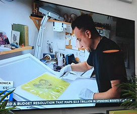
Restoration wizard Ron Barbagallo brings new life to historic animation art
By Kristopher Gee
August 9, 2021
© Disney Enterprises, Inc. and Pixar Animation Studios
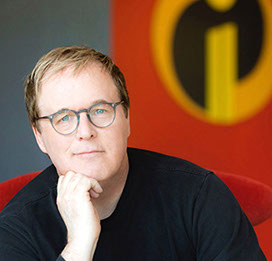
BRAD BIRD's Amazing Story, from leaving Disney
onto fixing The Iron Giant
and the Road Less Traveled
WORLDWIDE PUBLICITY for
the Lost and FOUND series
SALVADOR DALÍ’S DESTINO:
Lost, Found and RESTORED - 2015


ARTISTIC DISCOVERY
By Ron Barbagallo - July 12, 2019
The Destino Animatic, and the Fate of Assembling Artistic Truths into a Greater Whole
As a follow up to his 2017 Society of Animation Studies Keynote speech at Padova University (Destino, and the Fate of Assembling Plastic Truths into a Greater Whole), Ron Barbagallo, the Director of The Research Library at Animation Art Conservation, offers a full analysis of his Destino Animatic in a peer reviewed essay in the SAS Journal for Animation History and Theory...
Artwork is from a private collection
The DESTINO Animatic,
and the Fate of Assembling Artistic Truths into a Greater Whole
PART OF the Lost and FOUND series FROM
THE RESEARCH LIBRARY AT ANIMATION ART CONSERVATION

PART OF the Lost and FOUND series FROM
THE RESEARCH LIBRARY AT ANIMATION ART CONSERVATION
LECTURE SERIES
Padova University in Padua, Italy - November 18 and 19, 2019
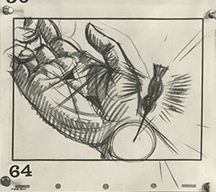
If there is a thread that runs through working at the Walt Disney Studio, it’s an inability of management to think long term about talent that doesn’t fit into the rigid theme of “do what you’re told” corporate ideologies. The particulars of these stories vary but the underscore is always the same: Some politician at the studio with an inflated impression of their power sent someone with unique talent to another company where they would prove their worth. In an educational lecture, Ron Barbagallo, the Director of The Research Library at Animation Art Conservation, will focus one such discarded Disney treasure: Production designer, background artist and layout designer Maurice Noble.
Maurice Noble and the Folder of Discarded Treasure

Diamond mine drawing by Maurice Noble made for Disney's Snow White and the Seven Dwarfs but not used.
ARTICLE
REVIEW
ARTICLE
ARTICLE


ART
FILM
ARTICLE
A BLADE OF GRASS
By Ron Barbagallo - 2003

Featuring background paintings from Steamboat Willie, Flowers and Trees, Mickey's Mellerdrammer, Snow White and the Seven Dwarfs and Bambi, this article is an aesthetic tour of the evolution that took place within 2D background painting at the Disney Studio from 1928 through 1942. It shows how one can make an impact on an entire genre by thinking outside the box, even if that impact starts with something as small as A Blade of Grass.
ARTICLE
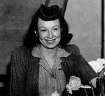
DISCOVERING HELEN NERBOVIG
By Ron Barbagallo - 1997
REVIEW
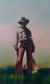
RICHARD PRINCE • COWBOYS
By Ron Barbagallo - 2013
But Fine Art is more than working within a theme of social commentary. It’s execution and, the use of color here is no small feat. It can be as bold as simple interplay or as unusual as a light blue smattering in a field of red/orange. It can overwhelm or cause you to pull back. But within the application, it is brittle with electricity, stoicism, and peppered with sadness - like a painted photograph of a family member you never met or a handwritten note from your long departed Dad.
Discovering Helen Nerbovig is the second of two matching pieces which give long overdue credit to Guthrie Sayle Courvoisier and Helen Gertrude Nerbovig. Two visionaries: Helen who is sometimes credited with the creation of the first cel setup, and Guthrie, who conducted the first wide scale distribution of animation art. Courvoisier and Nerbovig’s efforts overlapped and eventually intersected. This article chronicles Helen’s individual contribution and life journey.
REVIEW
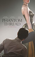
BEHIND THE PHANTOM THREADS
By Ron Barbagallo - 2018
Because at its very heart, the dress that Phantom Thread wears has nothing to do with the time period its set, or its beautiful couture. For all its alluring coloring and formal design, the film is an exotic bit of window dressing used to set a stage so PT Anderson can talk about something else - OBSESSION. Not just the obsession a woman has when she's trying to gain emotional completion from a man but the obsession a man can have for the bandage that is his work — and in ways that become less veiled where these obsessions collide and how they inspire.
REVIEW
WHERE THE WILD THINGS ARE
By Ron Barbagallo - 2009
But the pains of childhood and balancing act of single-parenting have many jagged edges and the story really opens up when Max runs away from home and encounters the Wild Things in the land where they live. Within short form we learn that the Wild Things are not waiting for Max to be his perfect playmates and that Max has not landed in some stuffed-toyed nirvana. Instead the Wild Things are fully realized characters -- charming and happy from first appearances but, like all of us, complex and vulnerable just under the surface.

ARTICLE
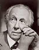
FRANK LLOYD WRIGHT
AND THE FIVE STAGES OF LOS ANGELES
By Ron Barbagallo - 2018
Frank Lloyd Wright first visited Los Angeles in January 1915, less than six months after the tragedy at Taliesin, and he would move there full time in early 1923. Still reeling from the loss of his home and family, Wright would within this time frame build five houses in LA that are linked by their concrete uniqueness and their ironic inability to be a home fit for anyone or anyone's family.
ART CONSERVATION
PRESERVATION HERO
To see a recent example of Ron Barbagallo's efforts in the partial repair and preservation of Animation Art, please check this link:
COMMENTARY
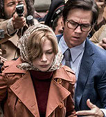
FOR ALL THE MONEY IN THE WORLD
By Ron Barbagallo - 2018
All the Money in the World is director Ridley Scott's new biopic about J. Paul Getty and the relationship Getty had with his family versus the relationship he preferred to have with money and the empire he built. It warns on the perils of addiction. Not just the addiction to drugs, or the addiction to power and money. All the Money in the World also warns on — the addiction to oneself.
INTERVIEW
TIM BURTON'S CORPSE BRIDE
FROM CONCEPT ART TO FINISHED PUPPETS
By Ron Barbagallo - 2005

Graham G. Maiden goes into detail describing his role as Puppet Fabrication Supervisor Tim Burton's Corpse Bride. Maiden's interview uses exclusive art and images from the film's production to narrate the many stages that went into making stop motion puppets for this film.
STRING OF ARTICLES
STATE OF THE ANIMATION ART MARKET
By Ron Barbagallo - 2003/2001/2000/1999/1997/1996
A compendium of articles I've written documenting the progression of the Animation Art Market. I update this thread of essays when the mood strikes me.