
COPYRIGHTS AND RESTRICTIONS AND CONDITIONS OF THIS WEBSITE
Ralph Eggleston joined Pixar Animation Studios in 1992 where he served as Art Director of their first feature film Toy Story. Afterwards, Eggleston helped develop the treatment and screenplay for Monster’s, Inc. and went on to write, design and direct their 2002 Academy Award®-winning animated short For the Birds. In the role of Production Designer he helped envision the undersea world of Finding Nemo and was Brad Bird’s choice for Art Director on his Academy Award®-winning animated film The Incredibles. Before coming to Pixar, Eggleston’s early work in animation included character animation for the Family Dog episode on the television series Amazing Stories.
Eggleston’s recent contribution for Pixar was as Production Designer for their cautionary tale Wall-E. Months after the film’s June 27th theatrical release, in October 2008 and January 2009, Eggleston discussed with me how he went about creating the futuristic environments for Wall-E.
How did you get involved with working on Wall-E?
Ralph Eggleston:
I first heard about a version of the project toward the end of production of Toy Story. It was just a concept and not much more. Pete Docter and Andrew Stanton had worked on solving some of the story issues over the years. The idea popped up more prominently toward the end of production of Finding Nemo and based on a very brief discussion of the story, I roughed out a first broad color script for Wall-E. I had no Idea I’d be working on the film at that time. I planned to take some time off after Finding Nemo, but, a few weeks into my break, Brad Bird asked me to help out for a few months on The Incredibles. That few months turned into almost a year and a half. After finally taking some well deserved time off, Andrew pitched me a more complete version of Wall-E and asked if I’d work on it. I told him, “I loved the idea, but that I didn’t draw robots and spaceships.” Andrew said, “Well, maybe you’ll bring something different to it,” so I told him, “I’d give it a try.”.
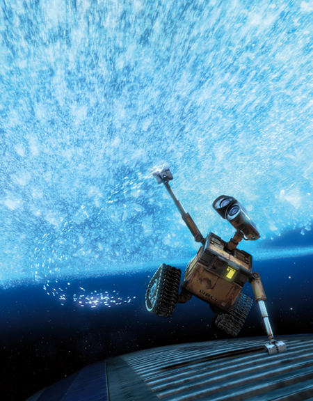
Wall-E communing in Outer Space.
A film told in two halves, Wall-E is a story that deals in contrasts. On Earth, Wall-E is alone and lovelorn surrounded by a world of abandonment and decay. His Earth environment is an essay in texture and earth tones. Conversely, in Outer Space, Wall-E and Eve fall in love in a place of commercial excess which is rendered in airbrushed tones of diverse and fully saturated colors.
Screen shot from the finished film (top).
Publicity art adapted from sequences in the finished film (bottom).
AN INTERVIEW WITH RALPH EGGLESTON,
Production designer on Pixar's WALL-E
DESIGN WITH A PURPOSE
© 2009 Ron Barbagallo


In many ways, Wall-E is a film about contrasts, not only from the point-of-view of its story,
but also contrasts and contradictions within some of its design choices. The film opens with
a portrait of a ruinous Earth inhabited by a diminutive robot. The second half of the film is contrasted by a high-end space resort full of overly-indulged humans.
Speaking in terms of its broad visual concepts and starting with the Earth environments,
how did you go about defining the looks of the film?
Ralph Eggleston:
As any of the great production designers would tell you, “Start from the character and then everything else will follow;” and it’s so true.
So we asked ourselves what is Wall-E, the character, about? Why is Wall-E in this world? What caused the Earth to become this? What was the company thinking? What were humans thinking? What did this company that took over the world try to do to solve the problem? Why were they unable to solve the problem? What about the world would convince the audience that this was once a real place?
Once you figure out what questions to ask you can begin answering them one at a time. You don’t have to build everything in Wall-E’s world, but you do need to understand every aspect of his world as best as you possibly can.
The idea behind Earth seemed straightforward, it was set in the future where the Buy'N'Large Corporation had taken over all business, government, utilities and transportation. To them over-consumerism was a good thing, this is a very relevant topic [given what’s going on in the world today].
While the film is about Wall-E and his relationship to Eve, the world [Earth] he lives in is the result of the Buy'N'Large Corporation’s slow response to the problem. In the opening moments of the film we see mounds of unsorted trash left by humanity, newer trash towers, and older towers in various stages of settling and decay. We also see scaffolding armatures that take the trash towers and incinerate them. We see dump trucks that take incinerated trash to the shipyard where the ships take the incinerated trash out to the ocean to dump. With little water available, everything turned to a dusty brown.
The futuristic city was based on consumerism run amok, where advertising has become more important than the product itself. It was fun to take this idea as far as we could, but the moment
the audience “got” the idea, we had to focus on the characters and the character moments.

At its heart -- Wall-E is a love story.
Screen shot of Eve and Wall-E from the final film.
What type of character and environment choices or attributes were you working with and what was the thinking behind your choices?
Ralph Eggleston:
The script provided the most obvious jumping off points. Wall-E is a square whose only limitations beyond his imagination is what he can physically do. Eve was a circle (an oval, actually) who only did what she was programmed to do. Wall-E has a soul; Eve develops one.
Early on, I pitched the idea that since Wall-E was a romantic we ought to think of lighting and coloring him and the entire Earth environment in Act One in classically romantic terms. Colors and lighting that highlighted his feelings. It’s all about emotion and that really provided the first clue.
In terms of the design of the Earth environments, it was simple, it was all about desolation. Wall-E’s world is filled with trash. He lives by himself on this abandoned planet. Earth is desolate, but Wall-E is romantic so we were able to use lighting to our advantage. Caricaturing the lighting to support the characters emotions. Because Wall-E was a mute character, we also had to use everything at our disposal to make the audience fall in love with him as quickly as possible.


To help tell the story and evoke emotion, washes of color were added to the stark Earth landscapes.
Digital Color Script by Ralph Eggleston (top).
Screen shot from the final film (bottom).
Regarding Act Two, I didn’t actually do a color script for it. [Instead] I designed the color per Axiom location -- as if I were an interior designer for Buy'N'Large, [with] an overall “master plan” in taking practical lighting into consideration more than romantic, emotionally-driven lighting as I did on Earth.
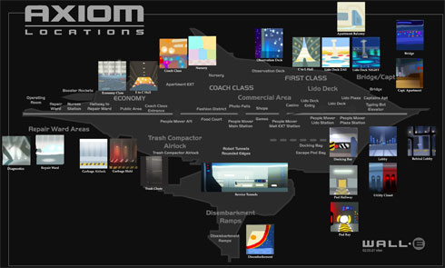
The idea that there were different classes on the Axiom was once more important to the story. But that idea fell away and what stayed is the audience’s ability to tell where you are on the ship at a moment’s notice, because of the color and lighting. If it’s dark blue; I’m in the bridge. It’s warm and comfortable; I’m in the Captain’s apartment. It’s very bright and high key; I’m must be on the lido deck by the pool; or if it’s gray, I must be in the engine room. It’s pretty straightforward when you break it down that way. Everything was very practical, which was about as far away from the organic nature of man-made trash as you could possibly get.
After you have a general idea of how you see the sets, how do you move forward?
Ralph Eggleston:
Once I’ve sold my basic concepts to the director, I tend to start by doing little concept sketches and color palettes, followed by roughing out color script work. It’s just a couple of little pieces that tend to be more art-story related than anything. I’m an intuitive artist, and can only work from a story point of view. I’ve said this many times before, but I really do imagine myself in the theater watching the film as I work. It puts everything into perspective.

Three examples of black and white concept art featuring Wall-E and his Earth environment.
Noah Klockek (top).
Anthony Christov (center).
Jay Shuster (bottom).
I’m also building a crew and start by assigning actual sets. I like to have three art directors: One for environments, one for characters, and one for textures. Collectively we look at the reels and talk to the director. Finding out what works and what doesn’t work, graphics and textures. We start going from there and really build it, bit by bit.
We have to balance our workload between sets that take place in many scenes, from many angles and have a lot of animation footage -- [as opposed to] sets that have relatively little screen time. Scenes that have little screen time can be more or less important to a particular moment in a story. A moment that is less important to the story might get a shorter schedule and lesser budget; and we’ll re-use things we’ve already got, reconfiguring a set, changing the set dressing and color, and lighting it differently.
A moment that is more important to the telling of the story, but is rather large is put on the “long term” planning track. Before spending so much money on large sets that might occupy little screen time, we let the story changes settle as much as possible and get the director used to the “look” of the film. We are also working out kinks in the production pipeline so that when the trigger is pulled to build these sets, we can do it as fast and efficiently as possible.


Hand drawn sketches and their corresponding digital Color Scripts by Ralph Eggleston.
Once the major design obstacles are laid out and agreed upon with the design staff and the director, I can jump back into the color script. Because we’ve done so much research and have begun understanding the world we’re creating, I can delegate to my crew a lot of what needs to get done. This allows me to get back in and focus on the emotional core of what we’re trying to say visually with color, value, and lighting, which usually takes me well into production.
Do you work with traditional media like paint, pencil or pastel on paper or do you work digitally?
Ralph Eggleston:
It depends. I’ve worked in pastel and in paint, but Wall-E was the first time I’ve ever did it exclusively in Photoshop, digitally. I love the immediacy of paint and pastel. Working digitally was a challenge. When I began working on Wall-E I was not knowledgeable with anything other than the simple basics of Photoshop. The great thing about the computer is it affords endless change. The bad thing about the computer is it affords endless change. If I feel like I understand the world of the film I’m working on, I tend to go with my first gut response. I can always adjust it, but if I don’t at least get that down, I won’t move forward.
How do you start creating the imagery for an environment or set? What is your creative process like?
Ralph Eggleston:
I tend to jump in feet first and start with just doodling with little blobs of color all over the place, trying to find a storyline through the intuitive emotions of color. I suppose the easiest way to explain it is “method painting.” I put myself in the place of the character and walk through the story. I’m trying to find colors that evoke an emotion based on everything I’ve absorbed up until that date, reading the story, hearing a pitch, research.


Color for the sake of storytelling played a large role in the early conceptual paintings used to create Wall-E. The top group of four rows of art show how arid and warm earth tones were used to create a sense of vastness on Earth, while cooler more saturated tones were used for the interiors of the space ship Axiom in act two of Wall-E.
Color palettes and digital concept art by Ralph Eggleston (all six rows of images).
I’m often on the project before the story work is completed, offering up visual solutions to story issues, gathering all kinds of information and talking with the director. Then I go away and let it filter through my brain. When I start painting, I can’t let anything else enter my mind as I work. I have to go on my emotion. Then I’ll commission character studies by people in house or people out of house. I’ll give the artists a brief rundown of the possible storyline and the kind of world we’re creating. Not only because we don’t want them to know, but, because we don’t know yet.
In designing for Wall-E, what sort of imagery did you look toward for inspiration?
Ralph Eggleston:
We looked at the Mars Rover film and toured a cruise ship. We looked at Sea Lions for the blubber on the humans. Some of our artists went to the Jet Propulsion Laboratory (JPL) to look at robotics. I’m a big fan of architect Santiago Calatrava. I love how he organizes organic forms into beautifully patterned structures. It’s so futuristic, and yet very comforting as well.

The influence of architect Santiago Calatrava can be seen in the top two pieces of concept art while the bottom piece of art shows the influence of Tomorrowland at Disneyland.
Concept art of Docking Bay by Anthony Christov (top).
Concept art by Kristian Norelius (center).
Concept art by Kristian Norelius (bottom).
The single biggest influence for some of the space stuff was a wonderful exhibit that Diane Disney Miller put on at the Oakland Museum to raise money for the Walt Disney Museum. Amazing concepts for the original Tomorrowland at Disneyland. Fun, so imaginative.
How did you go about choosing the colors for Wall-E?
Ralph Eggleston:
We tried different colors on Wall-E in terms of his body, but the color yellow reminded people of tractor trucks, which suited Wall-E’s job well. With a mostly brown and beige monochromatic world, there was some concern he might not read clearly, but choosing a bright, saturated yellow really made him stand out. We tried to shy away from that color elsewhere.
Speaking solely in terms of character, Wall-E is a diminutive, nearly child-like robot with a deep need to be loved. In some ways, his personality is reminiscent of another innocent mannered star who worked in the silent age, Charlie Chaplin. What design decisions did you make to help define Wall-E’s personality and the personality of his truck where he lives or shuts down?
Ralph Eggleston:
The key things to the design of Wall-E are his -- eyes, and the overall proportions of his body as it relates to his eyes. The first impression we wanted the audience to have is "child-like.” They were about to watch a whole feature starring a bucket of bolts; we needed to grab their hearts as fast as possible. We never wanted this to be a man in a robot outfit. I’ve seen many animated robots that were visually appealing, but I rarely believed in them, because they didn’t seem designed to do anything specific. Not so with Wall-E. He was designed by the Buy'N'Large Corporation to do one thing: crunch trash. Over the centuries of gathering trash, it seems he’s developed a soul and a personality.

Five examples of concept art of Wall-E.
Drawing of Wall-E by Jay Shuster (top left).
Drawing of Wall-E by Jay Shuster (top right).
Drawing of Wall-E by Jay Shuster (center left).
Drawing of Wall-E by Jay Shuster (center right).
Digital painting of Wall-E and texture studies by Laura Philips (bottom).
Since Wall-E was going to be a primarily pantomime character, making his eyes bigger seemed a logical choice. Adding the mechanical details of the inner workings of lenses and binoculars gave Wall-E’s eyes a range of subtlety that gave the animators more to express with. As with all great silent films, the audience was asked to bring something more to the table than a film with sound. Rather than paying so much attention to dialogue and sound carrying the story forward, they’re asked to imagine what the character is feeling and continually guess what the character is going to do next.
The interior of the truck was a real challenge, because it was a major set that was relatively confined. With the possibility of so many unknown shots and angles being asked for, we couldn’t cheat as much as we’d originally hoped. We had to design and build virtually everything in the truck. We had a ton of visual gags about what Wall-E had collected, some very funny, but we opted for objects Wall-E as a character found interesting. The laughs came from how he innocently arranged the objects on his shelves.
He’s collected lights of various sources powered by car batteries, but even he keeps the lights to a practical minimum until he invites Eve back to his pad, wherein he pulls out the stops and turns on all of the lights he’s gathered -- making the truck look like the inside of a warm, inviting Christmas tree.

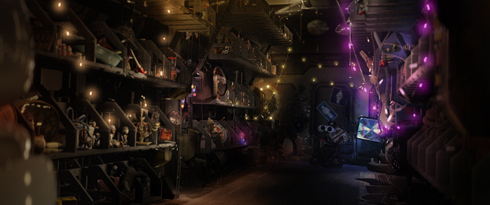
The interior of Wall-E's truck.
Digital Color Script by Ralph Eggleston (top).
Digital paint over by Ralph Eggleston over a Master Lighting of Truck by Andrew Pienaar (bottom).
In the beginning of the film, in looking at the Earth environments, you established a lot of earth tones and, rather than going the usual route by making the earth tones cold in nature, you’ve imbued a lot of saturated, warm reds, oranges, yellows and magentas into your earth tone imagery. There are not a lot of blue casts and a limited if any use of purples or greens. In essence, you took a material that is usually depicted in rather cold tones -- the color brown and made it feel warm. This is the opposite of what an audience might expect.
Can you explain your use of color, as it pertains to the Earth environments in Act One?
Ralph Eggleston:
The color script of [Earth] Act One is very dull and muted, in terms of lighting and color. When Eve arrives the colors get more saturated and the general environment subtly shifts from tan to soft pinks and blues. As Wall-E and Eve get closer and closer, the colors get wildly saturated like in the scene where Wall-E introduces himself to Eve, or the scene by the campfire light of the ship burning, or the multitude of colorful lights in Wall-E’s truck when he brings Eve home.
When Eve sees the plant (this is first evidence of any green color), she shuts down and Wall-E waits for Eve to re-awaken, we begin a visual recapitulation of everything that has happened earlier in Act One except now in a higher key. When Wall-E finally gives up and goes back to work, the lighting and colors go back to when we met Wall-E at the beginning of the film.
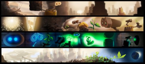
Visually, the color green is as much a central character throughout Wall-E as any of the film's leads. Seen above, via the simplified and caricatured medium of Color Scripts, the absence and presence of green function as a focal point for hope throughout the film's plot line.
Digital Color Scripts by Ralph Eggleston (all images).
The color green plays a fairly significant role in Wall-E. Since the Earth has been covered in trash, and since most natural resources have been used up, the green of a small plant provides hope for the world. I was surprised how hard it was to keep the color green from creeping into the film before we wanted it to (in the scene where Wall-E finds the plant). It did creep in a bit earlier than anticipated, however -- in a shot that was rushed through production to use in a trailer. The Rubik’s Cube Wall-E collects has some green squares on it. The shot was supposed to be revisited, to desaturate the green a bit, but the schedule didn’t allow us to fix this.
Many of the lighter areas in the Earth environments appear to be washed out of any color and are unusually devoid of detail. This visual decision creates a sense of vastness, emptiness and even off-worldliness to your vision of Earth.
Ralph Eggleston:
Exactly, one of my goals on this film was to bleach out the whites. I wanted the audience to feel like they might need their sunglasses while they were watching the movie. It was as much about making the world a harsh place for Wall-E as it was about over-exposing the image to give an immediacy to these scenes. It makes Wall-E so vulnerable.


Seemingly over-exposed exteriors on Earth were created to give a sense of vastness.
Lighting study by John Lee after Color Script by Ralph Eggleston (top).
Screen shot from the final film (bottom).
There’s another aspect to the design of the Earth environments that is rather innovative, and that is how you used the presence of texture to create staging areas.
Traditionally, staging areas are created through lighting and color values. However, a good deal of the surfaces of Wall-E himself and the Earth environments in Act One contain an almost hyper-realistic sense of texture. The values used to resolve the flat fields of texture have a lot of presence and the shadows that fall from these tiny bits of texture seem nearly silhouetted with little gradation extending from the edges of the texture.
In addition, the intensity of the textures seems to soften and become less prominent in the areas away from the main source of action within a scene. This creates an odd visual dichotomy. You add harsh detail and then decide to blur it out.
What was your thinking as you were designing the surfaces on Wall-E and the Earth environments?
Ralph Eggleston:
I am so happy you picked up on this, because I love it and it’s a direct result of our layout cinematographer Jeremy Lasky’s brilliant use of focal length to highlight the character moments. This has been used in a lot of films, to be sure, but never -- in my opinion -- to such great advantage from a storytelling point of view.
In the course of designing the film, I couldn’t know precisely how and when this would be utilized, as the story was still evolving, and the animation was still not complete.
If you think about the trash sets of Earth in Act One, it was never about individual pieces of trash or even groupings of trash. It was about all of the above, with atmosphere, texture, light, and time as well. In other words, it was never about any one of those elements, but the right balance of all of those elements.
We did many paintings showing the towers of trash at close, medium, and far ranges, towers that were old, and new, clean towers, dirty towers, really dirty towers, collapsed towers. We’d did paintings showing sections of crushed cardboard and crushed fabric, and paintings of every stage of decomposition for different materials, like plastic, paper, metal, different kinds of metal.
As the trash recedes into the distance, through haze and atmosphere, the details fall away, but the chunks of trash actually get larger because we needed to maintain clear silhouettes. Objects that look right close up tend to fall apart and become very plain looking through haze and atmosphere.


Using texture to create an area for the audience to focus was key on the Earth environments.
Trash Cube Degradation Studies displaying various stages of decay by Laura Philips (top).
Trash Tower Overview showing various stages of decay;
Drawings by Anthony Christov / Paintings: Laura Philips (center).
Atmospheric Effects on Towers by Laura Philips (bottom).
So, we actually had to caricature the trash as it receded from camera through the atmospheric haze. To say that a lot of attention was paid to the detail is true. But, I think the final film reflects very careful choices in what amount of detail we wanted to reveal and not photorealism.
And, a lot of our design choices were also a practical matter. Our world on Earth was (virtual) miles across. Rendering some of the vistas is very expensive and time consuming. Rendering five or six towers with all that modeling and texture is incredibly slow. In the end, it was a practical matter that we used to a design advantage.
Let’s talk about the space environments and the ship, the Axiom. In a lot of ways, the design of Act Two is almost the direct opposite of the Earth environments in Act One. In space, the designs seem more modern. There is less of a concern with accentuated textures almost to the point of seeing airbrushed. The colors are more saturated and are nearly primary colors against a lot of blacks and whites. What was your thinking as you went about designing the space environments?
Ralph Eggleston:
We wanted to contrast space as much as we could from the Earth. We backed off on the “romantic” approach to lighting, opting instead for a very practical lighting scenario that was derived from how Buy'N'Large designers would have lit the Axiom. We let the characters play out the scene in this antiseptic, sterile environment.
Our main inspiration was paintings of the future by Disney artists designing the original Tomorrowland at Disneyland and NASA designers planning the future of space travel from the 1950s and 1960s. It was the idea not of what was practical, but what might be possible. We always liked the phrase “Where’s my jet pack?” in reference to the cool future once imagined and why it isn’t as cool as they’d imagined it?!!
We went on a couple of cruise liners and one thing we discovered was that cruise liners have international staffs. Behind the scenes there’s very little wordage to explain things to the staff; it’s all told through imagery and graphics. That was one key for us. The other thing was that every room, every place we went, every restaurant we saw was themed, like when you go to Disneyland. We designed the Axiom like one of these cruise ships where everything is designed and every room is themed.
Color/Lighting map for the Axiom displaying color and design choices.
Digital art by Ralph Eggleston.
We wanted to create every set on the Axiom from Buy'N'Large’s perspective. The Buy'N'Large Company wanted to smooth over the effects of having to go into space in the first place, and what better way to do this than provide for every individual passengers every want and need.
We started with three different classes on the ship. This came about originally to help identify to the audience where Wall-E was, not to delineate different classes of people. The more the Wall-E and Eve love story was refined, the less the “class” issue was utilized for anything more than immediate location identification for the audience -- a very important issue -- especially in action scenes.
The three classes of the Axiom were delineated by shape, color, lighting, organization, and texture.
Economy class (the rear) was more boxy in shape, more basic in texture, more gray and cement composite in texture, and more centralized in its amenities. There are more apartments per square foot, and these surround a very straightforward central mall area. The graphics, which really do take up a majority of the screen space in this area, were kept to the colors of Buy'N'Large: white, blue, and red. There are a few other colors in the graphics, but the predominant impact was intended to be very basic.
Concept art for Economy Class.
Lighting Studies of Economy Class for the Axiom by John Lee (top and bottom).
The coach class part of the ship is by far the largest of the living/shopping areas. It was based on “S” shapes and the idea of “what’s around the corner.” We put bigger flashier signs a little further away from the central decks so as to lure customers along. Color is everywhere, but is mostly on the signage. The understructure is a very simple palette of off-white, smoky grays, and stainless steel to unify the environment. The structure of the Coach Class is sleek and multi-teered, and the impression of business comes more from the animated signage than anything.


Concept Art for Coach Class.
Lighting Studies by Daisuke Tsutsum (top and bottom).
My initial response was to put fewer larger signs, cleanly organized, to give simple clarity to such an enormous space. The director wasn’t sure of all the shots he wanted, so he opted to put more signage everywhere initially. As the shots were finalized, he realized it was hard for the audience to follow the characters, so we went back to my original plan of fewer, larger signs. It was ultimately easier on the eyes, and really does lend a sense of scale to the environment which was the director’s main intent.
The premiere class part of the ship is in the front. It was designed as a large, Zen-like spa. The shapes are circular and the color palette very limited to cream, turquoise, and tan. This set leads directly to the Captain’s Quarters and the Bridge, which both exemplify the characteristics of their intended needs. The Bridge is sleek, dark, and reflective, while the Captain’s Quarters is very warm and inviting, with carpet, wood, and some glass and metal accents.

Concept Art for Elite Class.
Lighting Study by John Lee.
Again, while the idea of an internal “class structure” was discarded from a story point of view, from a visual and practical point of view, it was invaluable as a communication tool to the audience in regards to describing the geography of the Axiom.
Designing outer space means designing a place that is completely abstract, but has to feel real. How did you go about designing something so vast and expanding as outer space? In particular, could you talk about the scene where Wall-E is flying in outer space?
Ralph Eggleston:
I always love when we get to do sequences like that in our movies. In Nemo, you had them journey through the reef and this is kind of the equivalent. They’re so much fun to visualize, so exhilarating, and so incredibly difficult to do, especially in space. When they work, they chip away at the audience’s idea of what’s real and allow you to make a few leaps in logic that otherwise would not work. The holy grail of great filmmaking is -- the suspension of belief.
One such sequence which we called “Space Travel,” is where Wall-E hangs on to the Recon Ship carrying Eve back to the Axiom. While the shots weren’t particularly difficult to build or shoot, they were difficult in the sense of conveying Wall-E’s sense of wonder at a universe he’s never seen.
PRODUCTION PAINTINGS FOR LIGHTING

Approaching the Axiom’s environment as a set in space posed particular problems of scale and location identification. Many people have seen pictures of Nebula taken by the Hubble telescope, but the sense of scale is so massive as to be almost unbelievable. Having the Nebula envelop the Axiom from screen left was done to give some point of reference for this and upcoming sequences -- such as the one where Wall-E dances with Eve in space. Without being overly-literal, I suggested that we approach the Nebula as if it were a castle on a mountain. I didn’t want it to look like a castle on a mountain top, but I thought that it’s something the audience would visually relate it to.
Once you have that grounding of screen direction, the audience always knows where we are and can focus on the characters. If it’s just a space environment, they’re not going to get a sense of speed, or distance, or scale of this world. As a practical matter, we really needed something there to help with that.
Another visual element that follows from the beginning of the film to the end of the film is the use of live-action elements, which was new for Pixar. Can you explain why and how that was incorporated?
Ralph Eggleston:
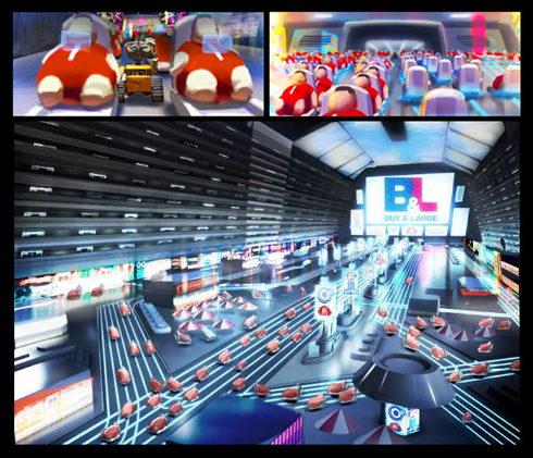
I don’t know exactly why that decision was made. The main issue for us was making sure our audience knew that it was human beings who were on this ship. Due to the physics of space and the Buy'N'Large Corporation having taken care of everything, humans have reverted into slovenly big babies. The easiest way for us to do that was to just show them as humans.
If we had shown them as even slightly caricatured humans, would it have worked? I don’t know. We didn’t do it. But if they’d been even slightly caricatured, it might not have been as clear how serious the devolution of humans had become. It was all about contrast.
Lastly, I’ve got a question that has nothing to do with the designs in the film, but is about the film’s use of the Hello Dolly music. If someone watching Wall-E were better acquainted with the music from Hello Dolly, would its use in the film resonated with the audience to a greater depth? I wasn’t sure if there was a deeper meaning as to why it was in the film.
Ralph Eggleston:
No, I don’t think so. I think it was the idea of the song and the contrast of the world you were seeing, the world of trash. So much of this film deals in contrasts and the song really grabs your attention quite well! Also, the director was in a High School production of Hello Dolly and had a soft spot in his heart for it. If anyone has video of this, I’d love to see it!
Digitally created lighting studies for Space Travel by Ralph Eggleston.

Digital Color Script by Ralph Eggleston.
Images are owned by © Disney/Pixar.
The author would like to thank Ralph Eggleston, Howard Green, Hilary Goss, Erik Langley, Arlene Ludwig, Samantha Garry, Amanda Sorena, Brian London, Beth Elyer and Sarah Baisley for their help.
Particular thanks goes again to Sarah Baisley for guest-copyediting this article and to Howard Green and Ralph Eggleston for the extra steps they took to make this article happen.
This article and interview is owned by © Ron Barbagallo.
ALL RIGHTS RESERVED. You may not quote or copy from this article without written permission.
YOUR USE OF THIS WEBSITE IMPLIES YOU HAVE READ AND AGREE TO THE "COPYRIGHT AND RESTRICTIONS/TERMS AND CONDITIONS" OF THIS WEBSITE DETAILED IN THE LINK BELOW:
LEGAL COPYRIGHTS AND RESTRICTIONS / TERMS AND CONDITIONS OF USE
INSTRUCTIONS ON HOW TO QUOTE FROM THE WRITING ON THIS WEBSITE CAN BE FOUND AT THIS LINK.
PLEASE DO NOT COPY THE JPEGS IN ANY FORM OR COPY ANY LINKS TO MY HOST PROVIDER. ANY THEFTS OF ART DETECTED VIA MY HOST PROVIDER WILL BE REPORTED TO THE WALT DISNEY COMPANY, WARNER BROS. OR OTHER LICENSING DEPARTMENTS.
ARTICLES ON AESTHETICS IN ANIMATION
BY RON BARBAGALLO:
The Art of Making Pixar's Ratatouille is revealed by way of an introductory article followed by interviews with production designer Harley Jessup, director of photography/lighting Sharon Calahan and the film's writer/director Brad Bird.
Design with a Purpose, an interview with Ralph Eggleston uses production art from Wall-E to illustrate the production design of Pixar's cautionary tale of a robot on a futuristic Earth.
Shedding Light on the Little Matchgirl traces the path director Roger Allers and the Disney Studio took in adapting the Hans Christian Andersen story to animation.
The Destiny of Dalí's Destino, in 1946, Walt Disney invited Salvador Dalí to create an animated short based upon his surrealist art. This writing illustrates how this short got started and tells the story of the film's aesthetic.
A Blade Of Grass is a tour through the aesthetics of 2D background painting at the Disney Studio from 1928 through 1942.
Lorenzo, director / production designer Mike Gabriel created a visual tour de force in this Academy Award® nominated Disney short. This article chronicles how the short was made and includes an interview with Mike Gabriel.
Tim Burton's Corpse Bride, an interview with Graham G. Maiden's narrates the process involved with taking Tim Burton's concept art and translating Tim's sketches and paintings into fully articulated stop motion puppets.
Wallace & Gromit: The Curse Of The Were-Rabbit, in an interview exclusive to this web site, Nick Park speaks about his influences, on how he uses drawing to tell a story and tells us what it was like to bring Wallace and Gromit to the big screen.
For a complete list of PUBLISHED WORK AND WRITINGS by Ron Barbagallo,
click on the link above and scroll down.
INDEX OF SERVICES
The Ethical Method of Repair
The Attention is in the Details
the Lost and FOUND series
RON BARBAGALLO: