
COPYRIGHTS AND RESTRICTIONS AND CONDITIONS OF THIS WEBSITE
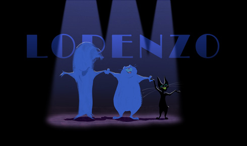
Comedy and color take center stage in Disney’s new short film Lorenzo.
Directed by Mike Gabriel, who also served as the film’s production designer, Lorenzo tells the story of a fat cat whose haughty manners become the cause of his own undoing. This animated short was based upon pencil sketches and a story idea created by Disney veteran Joe Grant 60 years ago. Shepherded by executive producers Roy E. Disney and Don Hahn, Lorenzo was given to Mike Gabriel who embellished Grant’s idea with his own paintings and storytelling to create a cinematic tango of brisk color, music and timing.
The look and feel of Lorenzo, is very different for a current day Disney film. Some of that is owed to Don Hahn, who first suggested that Gabriel consider using tango music as inspiration when conceptualizing the picture. Letting the accentuating rhythms of the tango be his muse, Gabriel went on to create conceptual paintings and produced hundreds of story sketches. He also designed the characters and painted production backgrounds -- ultimately tailoring every aspect of the film’s visual identity.
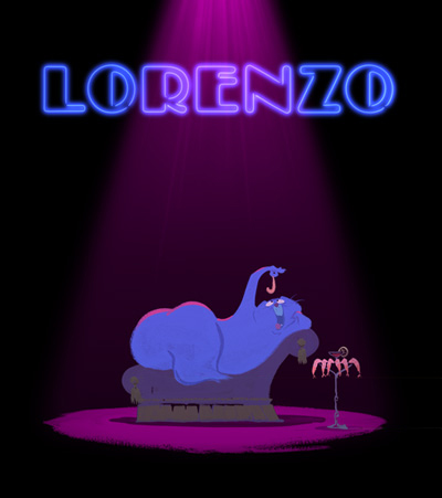
The poster for the Disney short Lorenzo.
LORENZO
As the concept phase of the film neared completion, Gabriel’s art, like the tango that inspired it, ended up having a transplanted European flair. This was communicated in his design choices and in the spontaneity of his paintings. Despite the fact that conceptual art at Disney is never anything more than a springboard for later design choices, the qualities in found Gabriel’s paintings were what the filmmakers most wanted to keep.
Producer Baker Bloodworth explains, “As Mike explored the look of the film, he painted tempera paints on black construction paper. He kept saying ‘I want the movie to look like this.’ Usually our visual development art is not what the finished film looks like, but we were so excited by Mike’s style that we wondered if it was possible to find a way to translate that to screen.”
The task of getting computer software to emulate the organic feel of quickly brushed paint as it seeps into black paper fell upon to a team of craftspeople - including Dan Teece, the team’s software expert, who came up with a new CG application called Sable.
Dan Teece elaborated upon the process, “With the characters in Lorenzo, there is a dry brush feeling, as if each drawing was hand painted. Mike wanted the viewers to feel like they were watching a painting move; as if the characters were painted frame by frame.”
To this end, Gabriel painted a series of brushstrokes in about 18 different styles that were then scanned into the computer. Once this was done, the digital team put curves -- 3D placeholders or indicators -- on all the key drawings. When combined through Sable, this led to a more articulate way to simulate the manner paint brushes onto paper. As digital effects supervisor John Murrah explains: “The only other alternative would have been to paint every frame individually, which would have given the film a very distracting and chattery look. This is a great example of adapting technology for a particular artistic purpose.”
Not only was Sable used to keep the spirit of Mike Gabriel’s paintings alive in the moving characters, but, as Murrah concluded, “His actual background paintings are in the film. He would paint the backgrounds and we’d either put them on cards or composite them in directly. You could go into his office and look at all the background paintings on the walls, and then go into the theater and see a lot of the exact material up on the screen, but with moving animation in front rendered to look like his paintings.”
Production still of Molly from Lorenzo.
Chords from a piano gingerly roll past a streetlight as a silent flash of lightning momentarily robs the landscape of color. This gesture not only marks the beginning of the Academy Award® nominated Disney short Lorenzo, but as reds, purples and greens return to the screen, also announces the key roles that color and timing will have throughout the film.
In many ways the visuals for Lorenzo seem effortless. Comedy. Music. Timing. Color. Character animation. Lorenzo has it all. To have these moving paintings appear on the screen the film’s director Mike Gabriel started drafting the project with pencil and marker. Later he used paint on paper to lend color and mood to the world of the blue colored Lorenzo and his black cat nemesis Malo. The hand drawn and hand painted images seen below are unedited and in the sequence they were created. All the art comes from the hand of Mike Gabriel and were used in the production of the film.
To accompany the art, Gabriel elaborates on the creative process behind the making Lorenzo -- from his storyboard direction on through creating the concept paintings for the film.
MIKE GABRIEL:
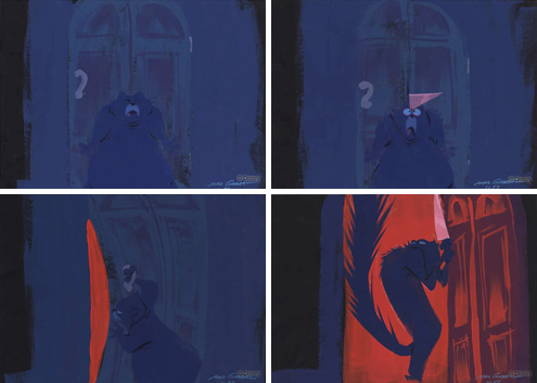
In doing my research for Lorenzo, I learned that the classic setting for professional tango dancers was under a single spotlight. With that in mind, I used city streetlights throughout Lorenzo to give the same effect.
Earlier in the film, with Malo’s introduction, I wanted to hint at his magical powers by having the streetlights blow out as he walked under them, an idea I got from Chris Buck. In Malo’s reappearance in the climax, we blew out the streetlight above Lorenzo to signal Malo’s return.
MIKE GABRIEL:
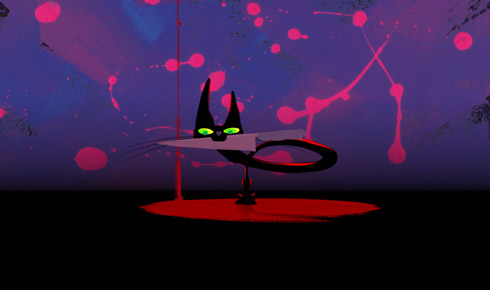
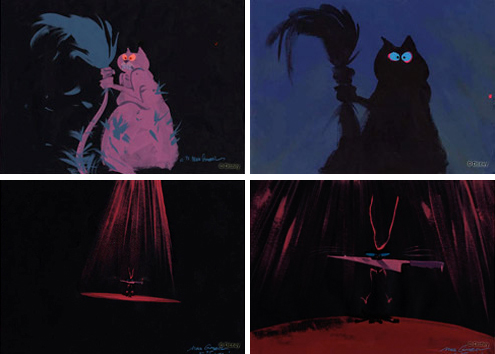
The knife idea is actually another classic melodramatic tango image, one of the revengeful woman tango dancer dancing with her unfaithful lover. Often she is depicted with a knife behind her back that she uses to kill him during the dance's final steps.
I had a little trouble pushing the envelope visually at this point. The music was really taking off, so I finally went a little nuts with Malo's neck, elongating and twisting it, tightening the narrative by having the knife come close and closer and closer, right at us.
Originally I was planning on just leaving this sequence's background black with a single streetlight, but with a black character against a black background I would have lost too much of Malo’s image by the time he came close to screen. I didn’t want a floating knife.
I never used music during Lorenzo as just beats to match the animated action. My attempt was to use the music as a film composer does, by letting the music reflect internal emotions not just physical syncopation. So when the music hits the strong punch, I don’t match it with a zoom in. I match it to the emotional punch reaction of Lorenzo and his tail to the sight of the knife in Malo’s teeth. I am matching emotion to the music -- not action to the beat, as if it is being scored post animation.
MIKE GABRIEL:
When the street light blows out, I decided to go into a silhouette of Lorenzo for two reasons. First, to punch the contrast for higher drama, and secondly to sneak his fur back to normal after all the preceding scene where Lorenzo becomes scorched and mangled.
MIKE GABRIEL:
This sequence marks the return of Malo, and the return of the color red to the film.
I started the film in reds to establish the danger and mood, and to inject Malo's scenes with as much menace as possible -- but have laid off them from the point in the film with green fountain on -- so that it would feel like a return not only of Malo, but of the color red. The more you can get a full circle feeling in your ending the better. This time the reds are hotter than before too. I saved the hottest reds for the end.
MIKE GABRIEL:
As you can see from the storyboards, I originally didn't have any wild paintings in mind behind the long neck dance. That came later on while making the character pose paintings for the production.
I would always play the music for Lorenzo as I painted the backgrounds to let it influence my color and design choices. The music really starts pumping here as Malo’s neck starts elongating so I started doing some wilder flings and splatters with the paintbrush, to follow the music’s lead.
While I painted some variations of different colored backgrounds, I let our editor Jessica Ambinder-Rojas play with the timings and cut to the beats to juice up the visuals to match the level of intensity of the music. I left her cuts exactly as she cut them together and in her order of shots, too.
At the last minute we switched the second cut back to Malo. It used to be just a repeat of the previous Malo scene cutting his tail action, but closer and closer. Baker Bloodworth thought we should do something new and make it more interesting. I came up with the "tick-tock, time is wasting" idea, and Baker added a nice touch with the idea to have Lorenzo's scared expression seen in the flash of the knife's reflection.
MIKE GABRIEL:
The tail almost had a pair of eyes along with it’s mouth early on. Roy Disney asked us to try a pair of eyes on Lorenzo, and in fact some of Joe Grant’s drawings had eyes on the tail as it came to life. I just felt it got a little creepy and less appealing to have these eyes peering out of the fur. I left them off and hoped the animation would prove the eyes weren’t necessary. Roy went with it without argument, and never mentioned it again. These guys know how to produce.
MIKE GABRIEL:
My color concept was to get very vibrant, lively hues pumping, but keep the hot reds out again to relieve the eye for the upcoming finale. I was a little nervous that this color blinking effect going on behind Malo's head coming forward with the knife was maybe getting a wee bit too "Aristocat-ty." The "Everybody Wants To Be A Cat" type affect. But the crew liked it so it stayed in. They were right as usual.
As Lorenzo contemplates a horrible proposition, the music gets intimate which allows me to dip down all hue, except pale pink, to give the upcoming reds as much punch as possible. I punched the value contrast between the reds and blues during the knife fight sequence where Lorenzo is fighting with his tail -- the darks and lights, and blasted the reds full screen for the first time.
MIKE GABRIEL:
The run back to the cafe goes from insane warped world into normalcy by the
time he reaches the door and ducks back into the cafe. Most people probably aren't aware that this is supposed to be the same cafe he started in.
Once Lorenzo is back in the cafe with the tail on the outside I wanted to flatten out all the values and eliminate the hot reds, so when the door is flung open you feel the sudden surge of contrast, really strong darks and lights, and hot red hues.
Plus I wanted the knife and Lorenzo's eyes to be the only thing you are watching, so I kept them lightest and brightest in the scene. Once the door is flung open I wanted to be at peak screen visual intensity so I pulled out the stops. Even the characters are drawn with sharp angles, rather than their normal curves.
The animation that was originally done for this scene was not quite wild or frantic enough so I asked the animator to really cut loose and go nuts with it. I told him to have the cat run cycled in four frames on ones. Full rotation of all four legs in four frames. I knew it could be done because I had done it on The Great Mouse Detective with Felicia running from Toby at the end of the film. When I opened this new pass at the scene up on my computer I flipped. It was exactly the level of madness I was hoping for, and then some. Superb intuitive animation. You can only get that kind of scene done straight ahead on ones.
MIKE GABRIEL:
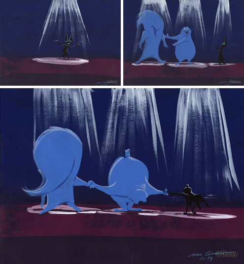
I was always amazed the studio never once flinched at the depiction of Lorenzo cutting his tail off. The ending was always going to involve the tail being cut off. But we never felt we should leave the audience in that emotional state. We needed an additional tag. The day before Don Hahn and I flew to London to record the music with Juan Jose Mosalini and his big Tango Orchestra, we both thought of the same idea. Have the band strike up a fast burlesque type version of the music and have the characters actually come out and take a bow to let everybody know no animals were harmed in the making of this short. All just cartoon fun, folks. We tried other ideas but this one where they take a bow seemed to set a nice upbeat tone, but I wanted to let the audience know that the tail was cut off nonetheless.
MIKE GABRIEL:
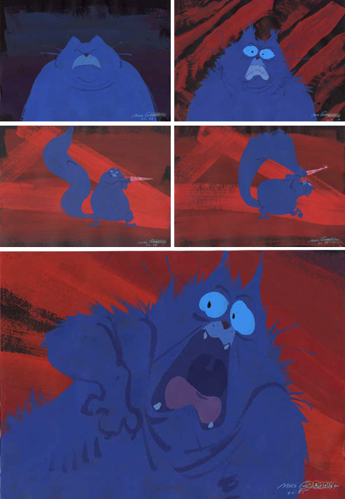
Here is Lorenzo's mental breakdown. It was up to me to try and express this cat's breakdown. The best way to do that was to feel it first inside myself.
In order to try to get that feeling into the backgrounds I first mixed up a huge pot of the fiery red I could mix, closed the door to my office, and got out a big fat paintbrush.
I mentally wanted to feel Lorenzo's intensity so I just stared at that Lorenzo expression until I felt I could feel exactly that intense mind set. Then I started firing away on the black paper. Anything, it didn't matter what it looked like. I wanted it to feel like anxiety, like insanity. I threw the paint around the room splattering my kids photos on the wall. Who cares, this was go for broke time. I ended up with about thirty or forty of these insane spatters of madness. I whittled them down to the few that felt most insane.
I hoped that if I felt in my body and brain the same feeling Lorenzo is feeling, somehow the emotion would be felt through the paintings. In other words I painted the backgrounds as if I were animating the backgrounds. Feel it first, then get that feeling onto the page. There is also a subtle intensifying of the red hue as the scene and his insanity progresses.
© 2004 Ron Barbagallo
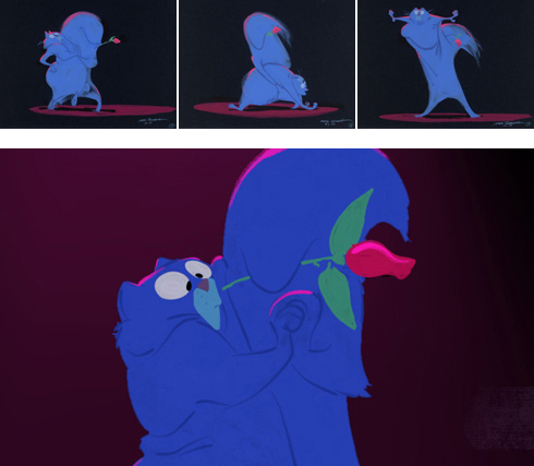
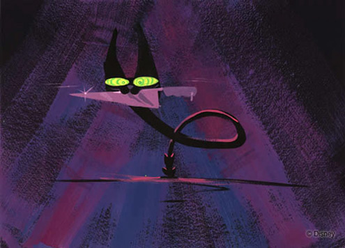
Top Row:
Three conceptual character poses for Scene 33 - 3, 4 and 7 as painted by Mike Gabriel in preparation for Lorenzo.
Media: tempera on black construction paper. Size: 13 1/2 inches by 18 inches.
Bottom Image:
A still production frame from Lorenzo where the computer program called Sable combined brushstrokes
created by Gabriel with key animation drawings to duplicate the look of his original tempera paintings.
Once pre-production was completed, many of the artists and technical teams at Disney Paris, who worked on the Salvador Dalí inspired, Oscar® nominated short Destino, helped to bring a genuine European sensitivity to Lorenzo’s final animation. When the time came time to score the film, the creators went back to the music that inspired Gabriel when he was creating the look of the film and commissioned Juan Jose Mosalini and his Big Tango Orchestra to record a brand new version of Bordoneo y 900.
Executive Producer Roy E. Disney recently said of Lorenzo, “Animated shorts are a wonderful medium for exploring stories, styles and creative visions that might not work in a feature format. It provides the filmmakers and animators with opportunities to be bold and experiment. And it allows us to try different approaches to our storytelling.”
As a completed work, Lorenzo, with its dancing hues of bright wet paint, never appears to the audience as a conventional CGI or 2D film. Instead Lorenzo feels like a back alley soiree painted right before your eyes. The short has its nationwide theatrical release on May 28, 2004, playing in front of Raising Helen, starring Kate Hudson and directed by Garry Marshall. Lorenzo will make his European premiere at Annecy on June 7, 2004.
A CLOSER LOOK -
Mike Gabriel on the Creative Process for LORENZO
© 2005 Ron Barbagallo
All images are © Disney Enterprises Inc.
The author would like to thank Mike Gabriel, Baker Bloodworth, Howard Green, Ray Morton and Dave Koch for their help.
This article and interview is owned by © Ron Barbagallo.
ALL RIGHTS RESERVED. You may not quote or copy from this article without written permission.
YOUR USE OF THIS WEBSITE IMPLIES YOU HAVE READ AND AGREE TO THE "COPYRIGHT AND RESTRICTIONS/TERMS AND CONDITIONS" OF THIS WEBSITE DETAILED IN THE LINK BELOW:
LEGAL COPYRIGHTS AND RESTRICTIONS / TERMS AND CONDITIONS OF USE
INSTRUCTIONS ON HOW TO QUOTE FROM THE WRITING ON THIS WEBSITE CAN BE FOUND AT THIS LINK.
PLEASE DO NOT COPY THE JPEGS IN ANY FORM OR COPY ANY LINKS TO MY HOST PROVIDER. ANY THEFTS OF ART DETECTED VIA MY HOST PROVIDER WILL BE REPORTED TO THE WALT DISNEY COMPANY, WARNER BROS. OR OTHER LICENSING DEPARTMENTS.
ARTICLES ON AESTHETICS IN ANIMATION
BY RON BARBAGALLO:
The Art of Making Pixar's Ratatouille is revealed by way of an introductory article followed by interviews with production designer Harley Jessup, director of photography/lighting Sharon Calahan and the film's writer/director Brad Bird.
Design with a Purpose, an interview with Ralph Eggleston uses production art from Wall-E to illustrate the production design of Pixar's cautionary tale of a robot on a futuristic Earth.
Shedding Light on the Little Matchgirl traces the path director Roger Allers and the Disney Studio took in adapting the Hans Christian Andersen story to animation.
The Destiny of Dalí's Destino, in 1946, Walt Disney invited Salvador Dalí to create an animated short based upon his surrealist art. This writing illustrates how this short got started and tells the story of the film's aesthetic.
A Blade Of Grass is a tour through the aesthetics of 2D background painting at the Disney Studio from 1928 through 1942.
Lorenzo, director / production designer Mike Gabriel created a visual tour de force in this Academy Award® nominated Disney short. This article chronicles how the short was made and includes an interview with Mike Gabriel.
Tim Burton's Corpse Bride, an interview with Graham G. Maiden's narrates the process involved with taking Tim Burton's concept art and translating Tim's sketches and paintings into fully articulated stop motion puppets.
Wallace & Gromit: The Curse Of The Were-Rabbit, in an interview exclusive to this web site, Nick Park speaks about his influences, on how he uses drawing to tell a story and tells us what it was like to bring Wallace and Gromit to the big screen.
For a complete list of PUBLISHED WORK AND WRITINGS by Ron Barbagallo,
click on the link above and scroll down.
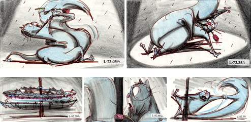
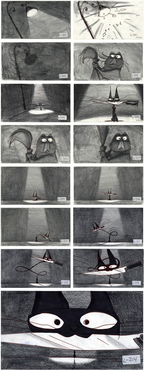
STORYBOARDS
All storyboards were drawn by Mike Gabriel.
Media: graphite pencil and marker on paper. Size: 5 1/2 inches by 8 1/2 inches.
© Walt Disney Company.
BACKGROUND STRESS PAINTINGS
CHARACTER POSE PAINTINGS
All background stress paintings were painted by Mike Gabriel.
Media: tempera on black construction paper.
Size: 13 1/2 inches by 18 inches.
© Walt Disney Company.

All character pose paintings were painted by Mike Gabriel.
Media: tempera on black construction paper.
Size: 13 1/2 inches by 18 inches.
© Walt Disney Company.
A series of five story sketches by Mike Gabriel from Scene 33 of Lorenzo.
INDEX OF SERVICES
The Ethical Method of Repair
The Attention is in the Details
the Lost and FOUND series
RON BARBAGALLO: