
COPYRIGHTS AND RESTRICTIONS AND CONDITIONS OF THIS WEBSITE
Disney’s Kim Possible is an animated TV show about a teenage high school girl who saves the world. It is also the first show of original material from creators and executive producers, Mark McCorkle and Bob Schooley, who wanted the look of their show to have a style as daring as the show's premise. The task of devising that style fell to art director Alan Bodner and executive producer/ director Chris Bailey, who along with a team of talented background artists, used futuristic designs from the past to help transform Kim’s comic book world into a visual adventure.
When Bailey first read the script for Kim Possible, he was struck by the humor found within the material. Even though Kim sometimes finds herself in situations that are grim and real, there was always an element of comedy. His first impulse was to visually complement that, which meant the characters and the backgrounds would have an element of humor within their design.
To that end, Bailey and Bodner looked to “futuristic” designs created during the 50’s and 60's. Free flowing lines, kidney-bean shapes and caricatured details became the springboard for some of the most striking, stand-alone background designs TV animation has seen in some time.
When asked how they arrived at this retro-modernist look, Bodner and Bailey had this to say:
ALAN BODNER:
We really started looking at some of the marionette shows, like [Gerry Anderson's Supermarionation TV show] Thunderbirds...
CHRIS BAILEY:
What was great about those shows was that they were trying to be modern. All the accouterments, buildings, and machines were the 50's and 60's versions of the future. They had an element of caricature to them, in that they were probably one third larger than they'd be in real life. If a character picked up a cup, or sat on a chair, it would be thicker and chunkier.
All images are © Disney Enterprises Inc.
The author would like to thank Karen Hartquist, Howard Green, Ray Morton and Dave Koch for their help..
This article and interview is owned by © Ron Barbagallo.
ALL RIGHTS RESERVED. You may not quote or copy from this article without written permission.
YOUR USE OF THIS WEBSITE IMPLIES YOU HAVE READ AND AGREE TO THE "COPYRIGHT AND RESTRICTIONS/TERMS AND CONDITIONS" OF THIS WEBSITE DETAILED IN THE LINK BELOW:
LEGAL COPYRIGHTS AND RESTRICTIONS / TERMS AND CONDITIONS OF USE
INSTRUCTIONS ON HOW TO QUOTE FROM THE WRITING ON THIS WEBSITE CAN BE FOUND AT THIS LINK.
PLEASE DO NOT COPY THE JPEGS IN ANY FORM OR COPY ANY LINKS TO MY HOST PROVIDER. ANY THEFTS OF ART DETECTED VIA MY HOST PROVIDER WILL BE REPORTED TO THE WALT DISNEY COMPANY, WARNER BROS. OR OTHER LICENSING DEPARTMENTS.
ARTICLES ON AESTHETICS IN ANIMATION
BY RON BARBAGALLO:
The Art of Making Pixar's Ratatouille is revealed by way of an introductory article followed by interviews with production designer Harley Jessup, director of photography/lighting Sharon Calahan and the film's writer/director Brad Bird.
Design with a Purpose, an interview with Ralph Eggleston uses production art from Wall-E to illustrate the production design of Pixar's cautionary tale of a robot on a futuristic Earth.
Shedding Light on the Little Matchgirl traces the path director Roger Allers and the Disney Studio took in adapting the Hans Christian Andersen story to animation.
The Destiny of Dalí's Destino, in 1946, Walt Disney invited Salvador Dalí to create an animated short based upon his surrealist art. This writing illustrates how this short got started and tells the story of the film's aesthetic.
A Blade Of Grass is a tour through the aesthetics of 2D background painting at the Disney Studio from 1928 through 1942.
Lorenzo, director / production designer Mike Gabriel created a visual tour de force in this Academy Award® nominated Disney short. This article chronicles how the short was made and includes an interview with Mike Gabriel.
Tim Burton's Corpse Bride, an interview with Graham G. Maiden's narrates the process involved with taking Tim Burton's concept art and translating Tim's sketches and paintings into fully articulated stop motion puppets.
Wallace & Gromit: The Curse Of The Were-Rabbit, in an interview exclusive to this web site, Nick Park speaks about his influences, on how he uses drawing to tell a story and tells us what it was like to bring Wallace and Gromit to the big screen.
For a complete list of PUBLISHED WORK AND WRITINGS by Ron Barbagallo,
click on the link above and scroll down.
THE BACKGROUND ART OF DISNEY'S KIM POSSIBLE
© 2002 Ron Barbagallo
ALAN BODNER:
We also looked at furniture books and the Disneyland attraction posters from the 50’s, which were patterned after the European travel posters of the last century. We liked them for two reasons: they separated the foreground and the middle ground very simply with a strong, almost abstract sense of shape and design. It has a real silhouetted look, using shapes to create contrast, a real distancing between foreground, middle ground and background. We wanted to utilize that in our show and marry those characteristics to our backgrounds.
CHRIS BAILEY:
It’s one of the things that was so critical to the show’s design. We wanted three degrees of value: a relative black, white and gray to each character and to each background setup. When Kim Possible has her black action gear on, there are no white lines to define the outside of her body. When her arms cross in front of her body or she walks in front of a black background she just disappears -- but because she has such a clean, simple design, the little flashes of flesh that you see on her arms or on her face or the little bit on her middrift, allow your brain to fill in where her body is.
ALAN BODNER:
This even played out when we were trying to do the design for the layouts. There was not as much a great interest in details. You could loose them in many areas. You don't need to see every facet of the furniture or every piece. As long as there was a real sense of perspective and there was a solidity to the objects and the environment, the designs were fine. It gets very abstract at times and it still works wonderfully.
CHRIS BAILEY:
Another thing that was critical to the show's design was, while the shapes tended to be very flat in nature, the one thing Alan and I wanted to do was to get a three dimensional sense of depth into the backgrounds. At the same time, we wanted to bring that kind of graphic sensibilities to Kim. I wanted 3D characters whose feet can be planted on the ground and communicate a sense of space. That’s where Alan came in, making an amalgam out of those two sensibilities.
ALAN BODNER:
When we started to see how the background designs were looking on film, it was beautiful. We found we could really push the color around even further as we went along. Whether it was in the North Pole, or Thailand or Cambodia, we wanted to get a very strong contrast. You could expect the color of the sky to go anywhere from green to chartreuse to pink. It was beautiful and the most fun.
CHRIS BAILEY:
I think as we went on Alan stopped using blue skies, even in normal locations. If you were to look at the shows chronologically you would definitely see a progression as the shows got more abstract and simpler in design.
CHRIS BAILEY:
The Jungle backgrounds paintings were a big breakthrough because their shapes got very abstract. Alan would just float plants in the air. You wouldn’t even know what things were, if they were flowers or what. But they were just these goofy fun shapes and it influenced the shows that came afterwards.
There is something else you might have noticed within the backgrounds. There are two textures painted into each shot: a little sponge texture or splatter texture. Alan didn’t really tie down where textures were going to apply within the backgrounds to the artists overseas. He described more a sensibility of how they should work. Let’s pretend you are in a wide shot and there is no texture in the wall behind the character. If you jump in close in the next shot, you want to add that texture or an abstract shape behind the character to provide a little more interest rather than being so literal.
Kim Possible, a Walt Disney Television Animation Production, premiered on Friday night June 7, 2002 at 6:30pm. Episodes continue to air on the Disney Channel.
Kim Possible First Season credits for Location Design are:
Bruce Berkey
Jason Hulst
Andy Ice
Alex McCrae
Kenneth McGill
Louis M. Police
Justin Thompson
Kim Possible First Season credits for Background Paint are:
Greg Gibbons
W. Ashby Manson
Nadia Vurbenova-Mouri
Teri Shikasho
Sy Thomas
Foreground tree elements, like the clouds, have been rendered as simplified eccentric graphic shapes are used to create an exotic feel to this night time exterior background painting.
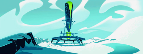
Swirling kidney bean-shaped curves within the clouds and snow frame this exterior background.
THE BACKGROUND ART OF
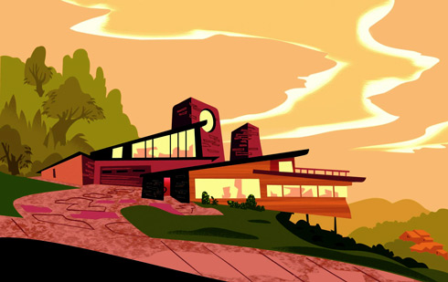

Exterior daytime (above) and interior night time (below) background painting of Kim Possible's 50's styled family homestead. Color values are used to establish a point of view and determine depth. Texture is added, not to give a representational appearance, but to suggest the feeling of an object.

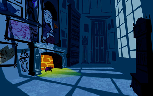

The use of three color values help establish a sense of depth within these interior background.
The darkest value used is the one where shadows are placed to indicate depth.
Texture applied to the floor, ceiling beams and monkey statues suggest a corridor made of stone.

INDEX OF SERVICES
The Ethical Method of Repair
The Attention is in the Details
the Lost and FOUND series
RON BARBAGALLO: